A healthcare staffing platform redesign focused on speed, consistency, and scalable product delivery.
Kamana required a development partner to scale its healthcare digital wallet and support its transition from a growing startup to an enterprise-level solution. This partnership aimed to accelerate product delivery while aligning with a new brand identity and a rapidly expanding user base.
When I joined, Kamana had shipped at high velocity for years without a design strategy, and it showed in two compounding ways: Unpredictable behaviors that undermined control, and UI inconsistency that made tasks feel harder than they were.
Role
Product Designer
Scope
UX Strategy & Design Systems
Industry
Healthcare Staffing
Users
65,000+
UX Audit
I audited the entire application and mapped each problem based on its impact on user experience and the effort required to implement the solution.

UX Audit of the Employer Dashboard and Workflows: An annotated overview of the employer platform highlighting structural inconsistencies, such as fractured visual experiences between talent and employers, shifting onboarding interactions, and unoptimized dashboard data hierarchy.

UX Audit of the Professional Validation Workflow: An annotated screenshot of the existing application interface highlighting major interaction friction points, including premature card reordering, inconsistent call-to-action elements, and cognitive overload from color over-use.
Main Pain Point
The first step of the staffing credentials workflow relied on Phoenix LiveView server rendering with real-time sorting. As recruiters worked through credential lists, completed items instantly reordered, disrupting their workflow and forcing them to repeatedly find their place. User analytics confirmed the problem, showing unusually high time-on-page and excessive scrolling, indicating friction in completing the task.
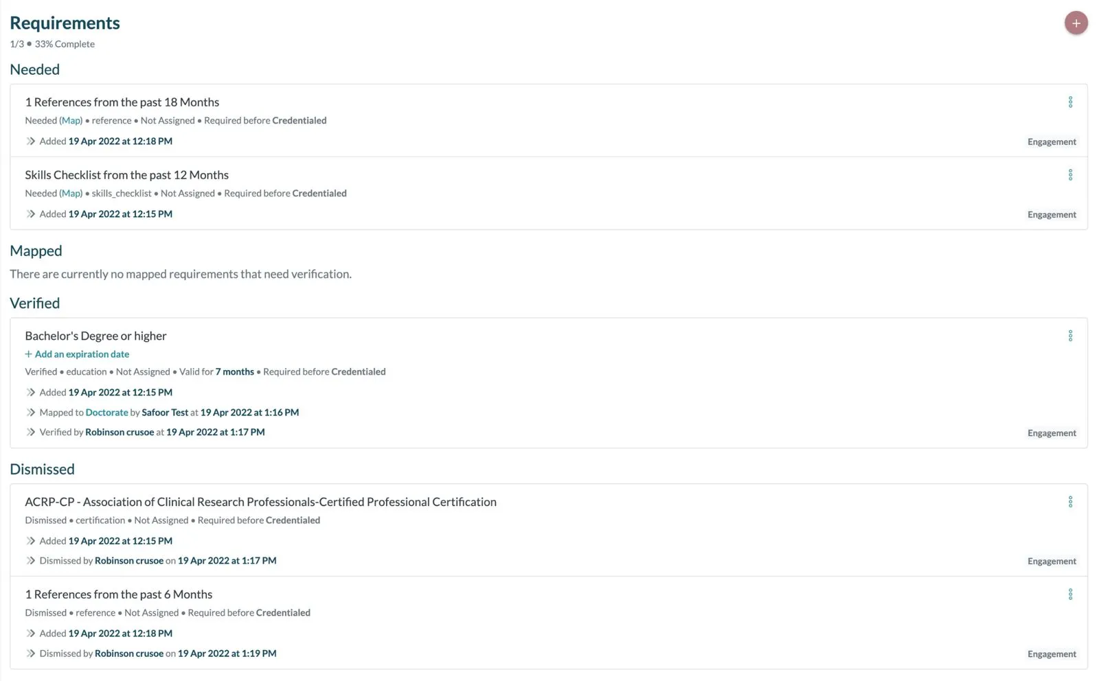
Real-time sorting caused items to shift instantly upon completion, forcing recruiters to constantly reorient themselves and hunt for their place in the list.
Low-effort Solutions
By leveraging my understanding of Phoenix LiveView, I redesigned the workflow by introducing a user-controlled Pause/Resume state through DOM patches, within the existing experience. This approach temporarily freezes live updates while recruiters sort, scan, and take action, then resumes streaming when they are ready. I also improved the validation journey by adding clear, persistent loading indicators and inline success/error feedback, creating a more predictable and transparent experience. After the feature launched, recruiters responded with overwhelmingly positive feedback, noting that the updated workflow was more efficient and significantly easier to use.
Atomic Injection component strategy
To reduce time-on-task across the product, I introduced a Tailwind-based component library and “injected” it incrementally into the highest-traffic workflows. Standardizing components reduced UI entropy, made primary actions more predictable, and lowered implementation cost.
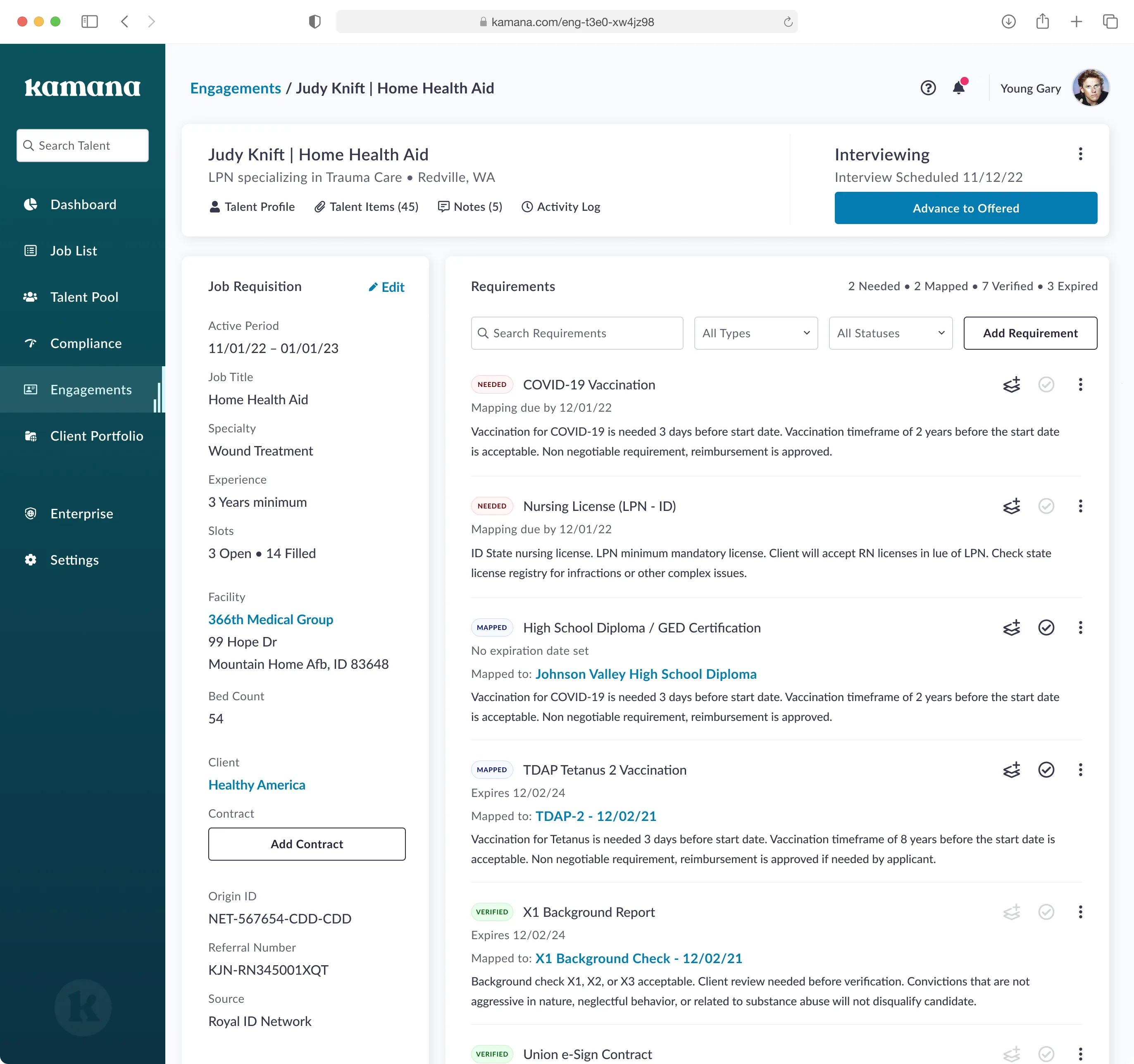
Pause/Resume Control: Introduced a user-controlled state to temporarily freeze live updates while recruiters sort and scan lists.
Streamlined UI: Implemented a Tailwind-based component library to reduce UI entropy and make primary actions predictable.
Accessibility
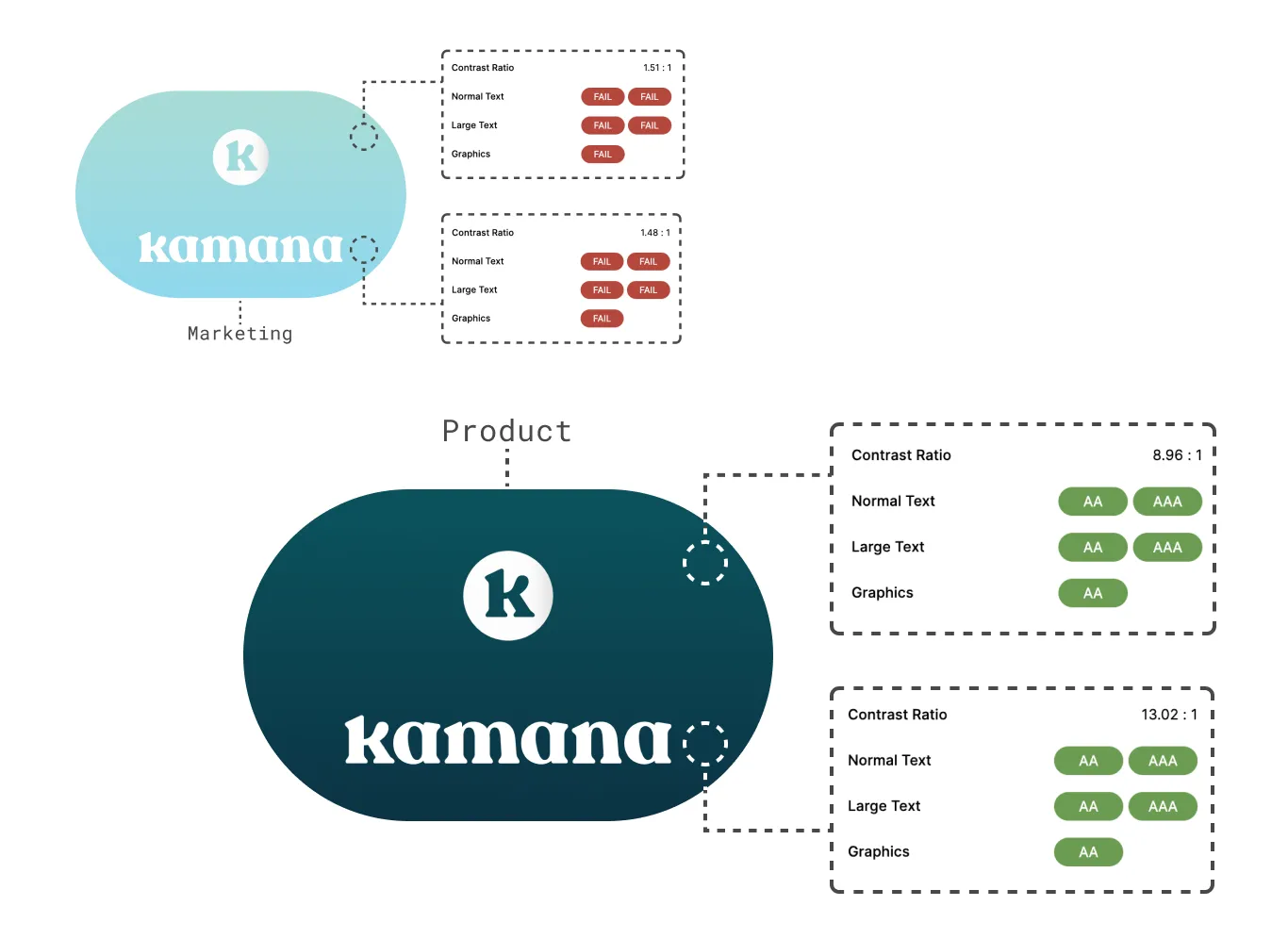
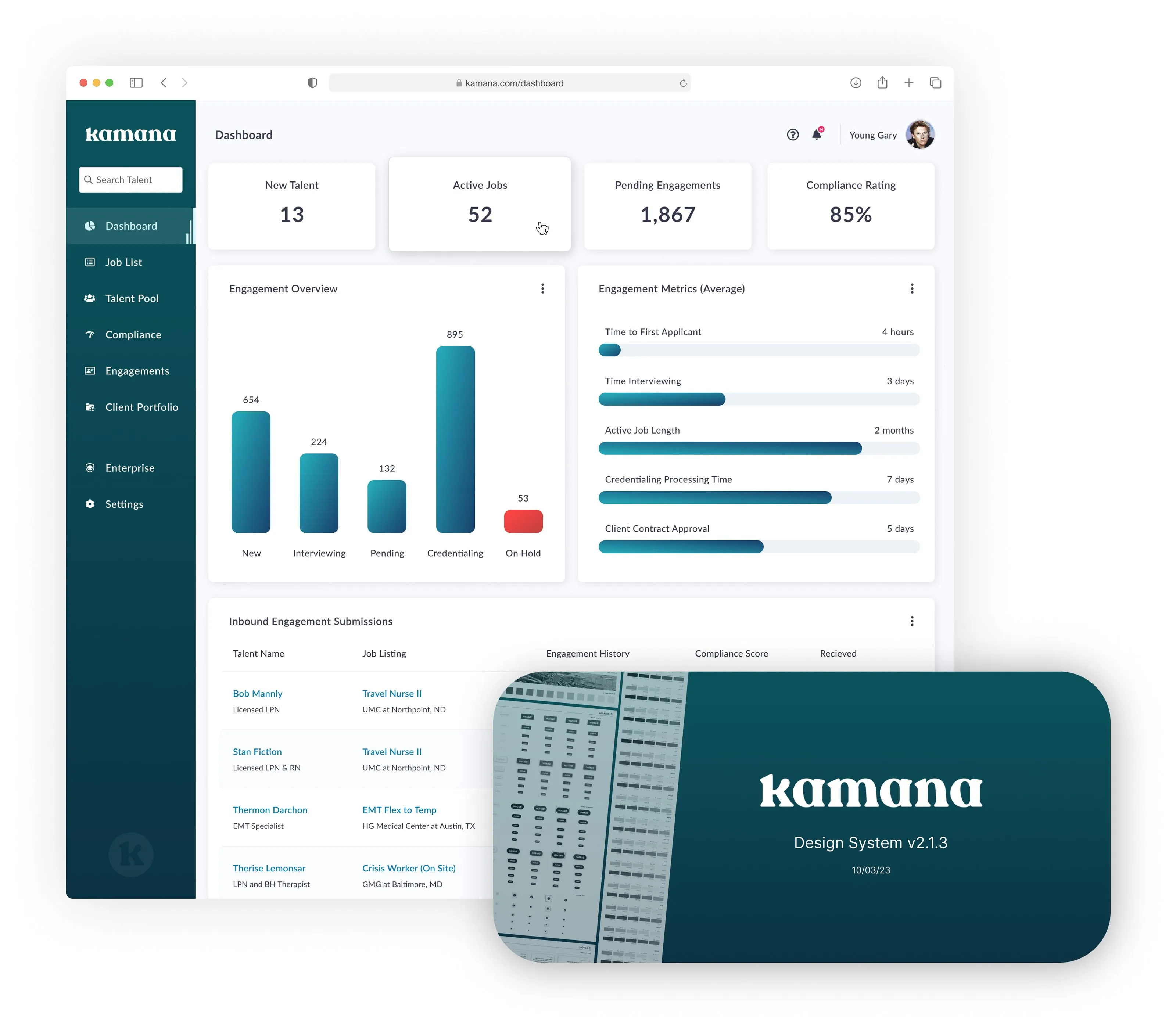
To balance Kamana’s modern rebranding with product usability, I partnered with the marketing team to refine their new gradient aesthetic into an accessible UI standard. We implemented the final schema using a library of reusable components, ensuring a cohesive and accessible visual language across both user portals.
Design Validation
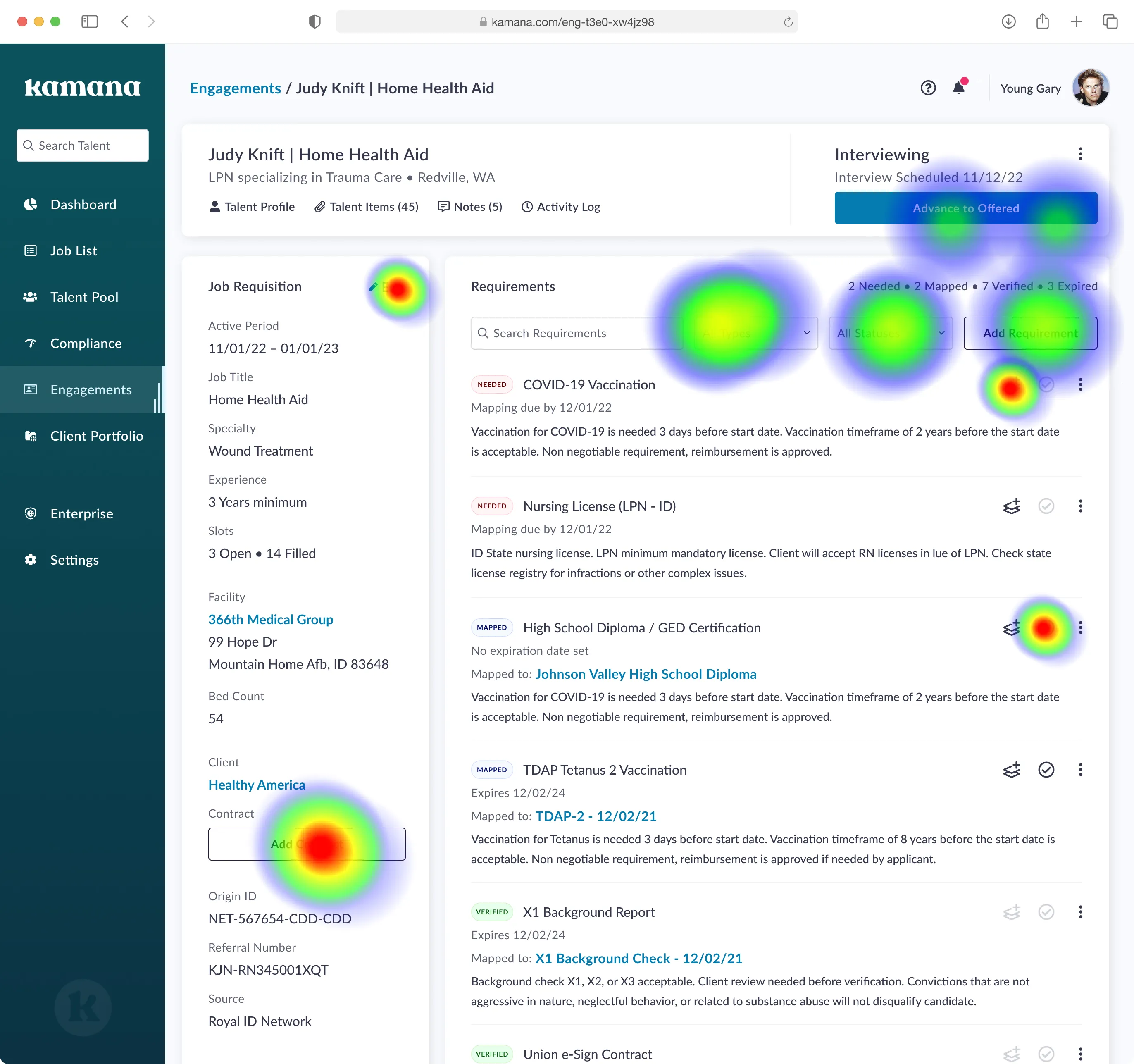
I established an affordable usability testing workflow by integrating Figma prototypes with Maze, enabling Kamana's growing team to validate designs with users and build confidence in product decisions before development.
Product Handover & Documentation
We delivered a comprehensive product document detailing our processes, decision history, design system, accessibility standards, and core product values. This documentation solidifies our established foundational workflows, serving as both a critical onboarding asset and a framework for the team to scale and evolve as the product matures.
Key Outcomes
This new manual-pause workflow slashed validation turnaround by ~80%, bringing it down to 2_4 days from an industry average of 10–28. By eliminating interface inconsistencies, the team lowered implementation effort and shipped high-impact improvements with greater predictability. Furthermore, standardizing components enabled the engineering team to build features twice as fast.
Core Lesson
UI is only half the battle. To scale effectively, a designer must ensure the tech stack aligns with human behavior. The goal isn't just to ship features, but to engineer interfaces that adapt to the user’s mental model.